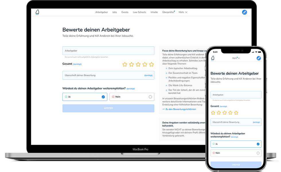
Redesign of the Employer Reviews
Product design, UI, UX, UXR

Background
In mid-2020, TalentRocket introduced the 'Employer Reviews' feature to its platform to provide job-seeking talents with deeper insights into employers. However, after six months and multiple promotional campaigns, the performance was not up to par. The Marketing team suggested the creation of a landing page to elucidate the feature before users started the review process.
As the lead designer overseeing the experience, I believed it was crucial to dive deeper before adopting that approach. With the support of the product manager, we allocated 2.5 weeks to thoroughly investigate and refine the strategy.
The experience
The original experience consisted in 4 steps where the user had to go through several input fields, start ratings and review the information in order to submit a review.

Research
Data analysis
Initially, I reached out to the marketing team to gather the performance data they had analyzed.
-
Users
-
Sessions
-
Pages per session
-
Pageviews
-
Avg. Time on Page
-
Bounce Rate
-
Registrations
Hotjar recordings analysis
I also analyzed 21 recordings of the user journey, taking note of general data for each recording, the steps within the journey, and the observed user behaviors.

Main findings
Usability
-
The qualitative fields appear to be confusing for some users.
-
There wasn't an option for users to specify an end date for ongoing employment.
-
During the preview step, it was unclear that the fields couldn't be edited.
-
The submit button remained active even when the mandatory email field was empty in the final step.
-
Users frequently couldn't recognize mandatory fields.
User Behaviors
-
Users often exit the process if they can't locate employers or roles in the dropdown menu.
-
Many users discontinue the experience upon reaching the qualitative fields.
Competitors analysis
Glassdoor
-
Single page form
-
You can get deeper into other aspects in additional forms, optional.
-
Different forms for current and former employer
-
Only one general star selector
-
Login before filling the form

Kununu
-
The review process is split into three: general, salary, and cultures
-
Heavy use of selectors instead of text fields
-
Login with just an email

Indeed
-
The form is split into two parts
-
The first step only has selectors
-
Only a few required fields

Ideation
After the research, I concluded that usability issues on the page contributed to the low performance. A redesign of the existing experience seemed more effective than creating a new landing page. To address this, I set up an ideation workshop, inviting the product manager and the marketing team to join.

Prioritization

Design solution
One of the primary objectives of the redesign was to enhance the visual appeal of the page and reduce its overwhelming appearance. We achieved this by leveraging components from our existing Design System and integrating a select number of custom components to enrich the user experience.
-
Minimized mandatory fields in the form.
-
The form dynamically expands as the user fills it.
-
Simplified the process to two pages.
-
Eliminated the preview step.
-
Enhanced components for better usability.

Results and next steps
After the redesign and improvements in the marketing campaigns, an increase in the number of users completing the experience has been observed. This has resulted in a significant rise in the number of reviews on the platform.
While descriptions are no longer necessary, it has been noted that some lower-rated reviews lack sufficient detail for employers to effectively respond to or address the concerns. Further investigation of this issue is needed to develop an effective solution.


