Smart Radio
Smart TV, UX, UI

Project Overview
The project's goal was to create a Smart TV version of an existing online radio application while keeping the simplicity and ease of use in the experience.
This project is a representation of a real published project. In order to respect company policies, I’ve redesigned the layout and visual aspects.
My Role
I worked on this project from start to finish as a part of the design team. This included doing research, creating flowcharts and wireframes, user testing, prototyping, as well as designing a finished user interface and developer handoff.
Discovery
Understanding Users
From researches and interviews with users of Smart TV music apps and existing data about the smartphone app users, we were able to conclude that the majority of users don't have familiarity with this technology, preferring simple solutions that deliver what they seek with low effort.
Another insight we had from the research was that, during the experience, the user doesn't interact with the content frequently. They put on playlists or stations of their favorite music genre and listen to it while making other activities. We also learned that the biggest pain point of the users was the login process, having to use the inputs of the remote control to insert email and password.
Competitive Analysis
We analyzed the interaction model of other Smart TV music apps, such as TuneIn Radio, Deezer, Spotify, and also streaming apps like Netflix and Amazon Prime Video.
From this, we were able to understand how we could make the login process easier for the user, how the navigation works, and also different ways to display the content on a Smart TV screen.
Wireframes
Log in Flow
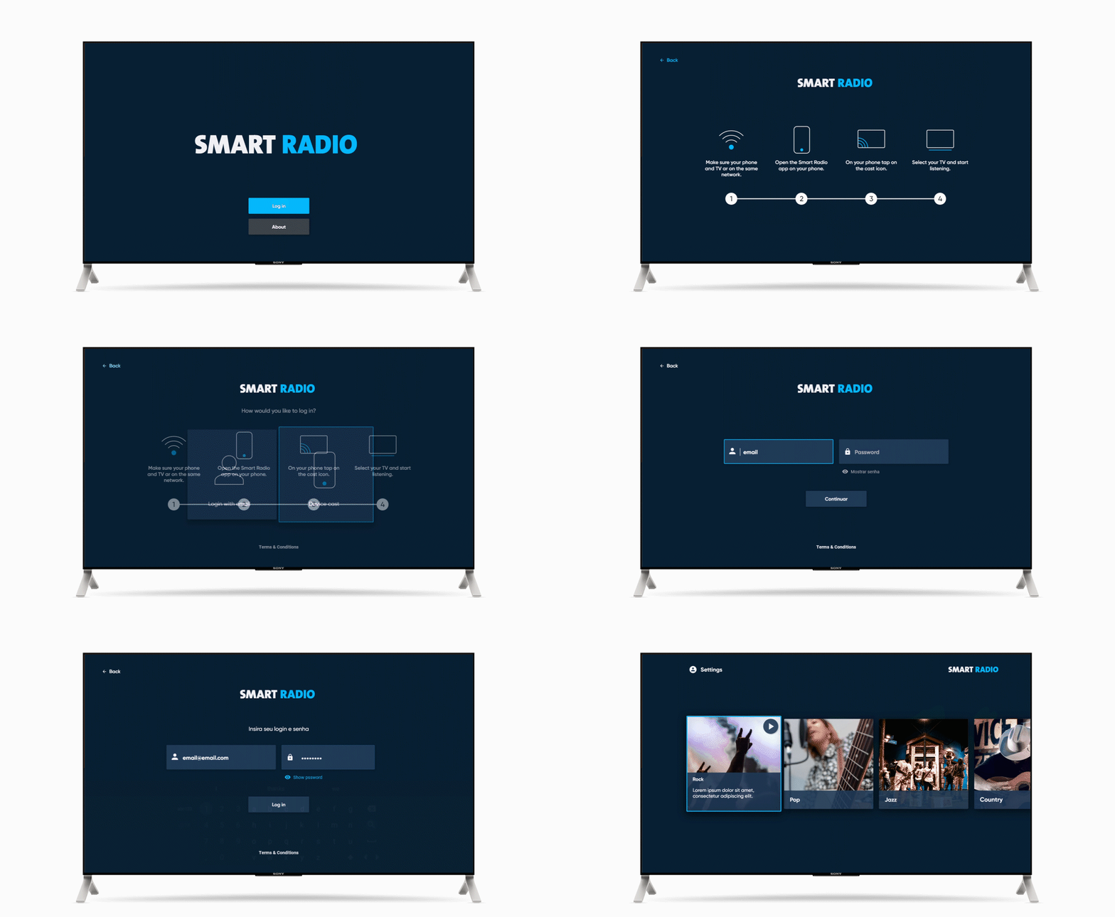
We chose to give the users two login options, allowing them to decide whether they make the login by inputting email and password data or through the cast of an already connected device.
In this case, we don't have the option to create an account, because the application can only be accessed by people that already have an account of one of our partners.

Home
To create a simple experience with easy usability, we chose to concentrate the app’s main functionalities on the main screen. Centralized on the screen, we have the stations in a row with a lateral scroll, a behavior that is common in Smart TV applications and well known by users. All of this was possible because there weren't a large number of music stations in the app.
In the screen's lower part, we have the music player, which is activated when the user selects a station. The player is composed of a play/pause button and the information of the station that is currently playing. The player experience is simplified. Since it is an online radio, we only have the option to play or pause the song and it’s not possible to go forward or backward. At the top of the screen, we have the navigation menu with the link to the options screen.

User testing
Testing environment
For the tests, a remote control was prototyped using a computer numeric board with stickers to simulate the buttons. We utilized a high fidelity functional prototype that was projected on a Smart TV, in an environment set to look like a living room.
Tests Results
In this first round of tests, we had a confirmation that the player’s experience worked according to the expectations of the user, who could easily find the desired station, pause it and play it with no difficulty. We also noted some confusion caused by nomenclatures and the arrangement of some elements on the screen.
From the test's feedback, we made alterations in the layout, such as adding a user icon in the settings menu. Then, a new round of tests was made. We verified that, after the alterations, the users had no problems with the experience.

Outcomes
The final solution is a simple experience, accessible for all users, even the ones who have no familiarity with Smart TVs, easily delivering songs that can be enjoyed while the user performs other tasks in the room.


